|
For this assignment, I was asked to create an original logo for an imaginary company. The tools that I used the most were the pen tool and the "D" tool. I drew my logo by pencil first, which I would then trace on Gravit Designer with the pen tool and adjust with the "D" tool. The most challenging part about the process was coming up with a logo design to start with. I overcame my challenge by sketching out all the different logo styles for my brand and then chose my favorite one. Here are the three different versions of my logo: 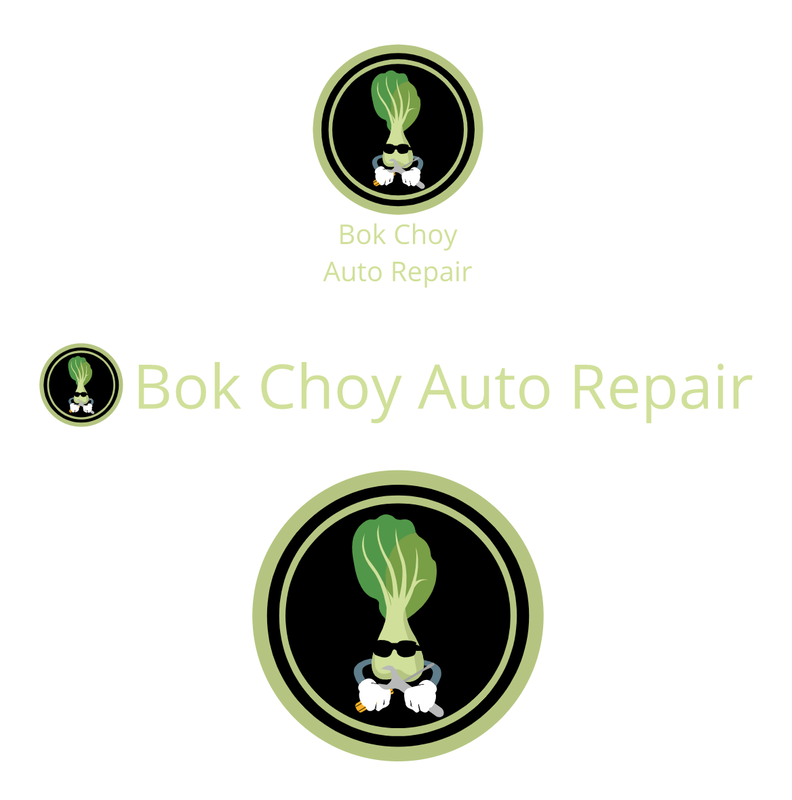 My company name is Bok Choy Auto Repair. Bok Choy was what my friends called me last year, and I am into cars, so that is how I created the brand name. I decided to create a logo like this for myself because I often see logos with a character inside a circular pattern. I also thought that it would be the best logo design. The logo is a picture of one sprout of bok choy with arms holding repair tools. This logo is my favorite because it has both thr logo and the words. It is also in my favorite format, with the text under the logo. 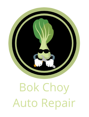
0 Comments
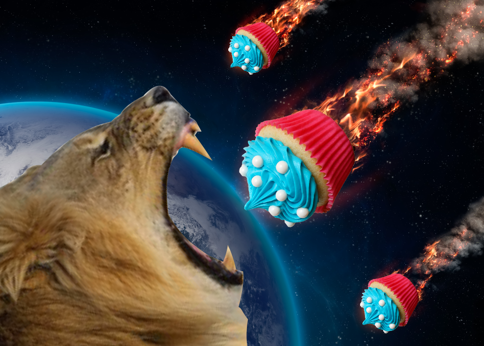
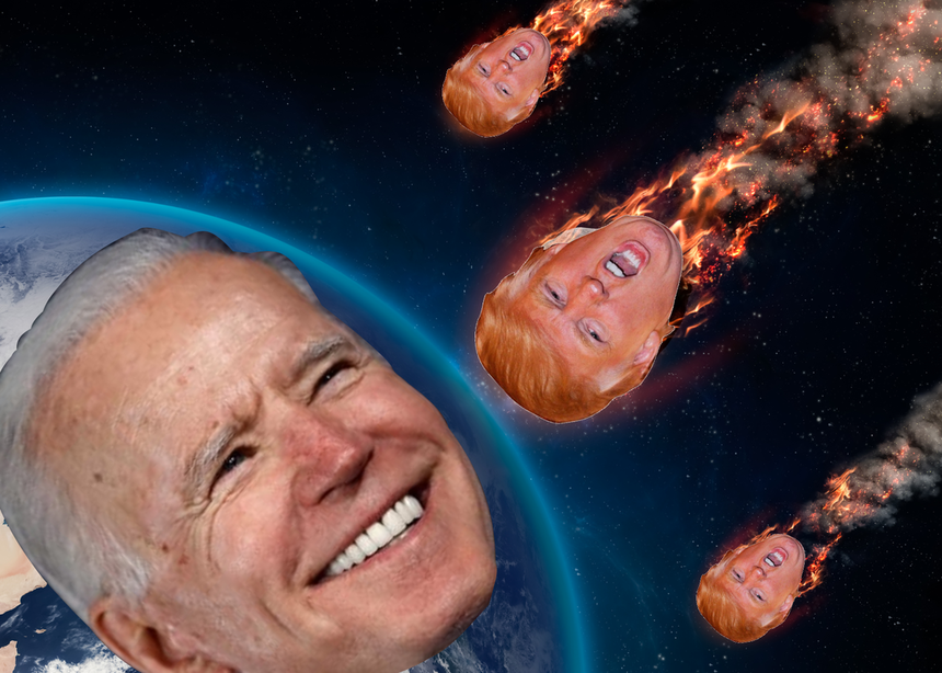
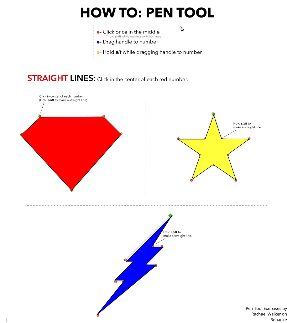
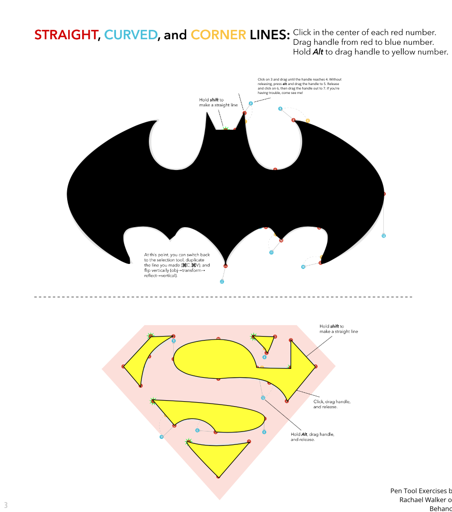
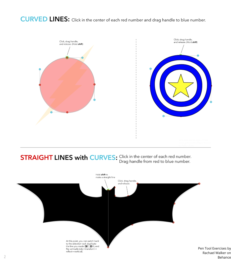
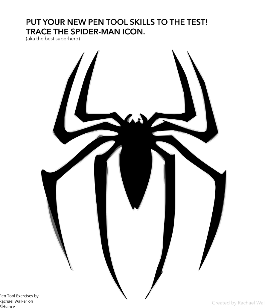
The largest challenge that I faced was when I was super close to finishing my color schemes project, I forgot to save my work, so I had to start over from the beginning again. I overcame this challenge by restarting and encouraging myself that I can make a better one than before. Some successes that I achieved were being able to trace some things very well and that my projects turned out exactly as I wanted to. I am very proud of the colors in my color names project, and how the design looks very appealing. I am also very proud of how I could incorporate colors into the cars in the color schemes project. The biggest tools that I used in Gravit were the pen tool and the "D" tool. There was an inspiration behind my artwork, which were the Nitro Type cars that I traced. For the color names assignment, I traced the Lacan Hypersport. For the color schemes assignment, I traced the Corsa Vengeneance, and I used Adobe Color to make my color schemes. Color Names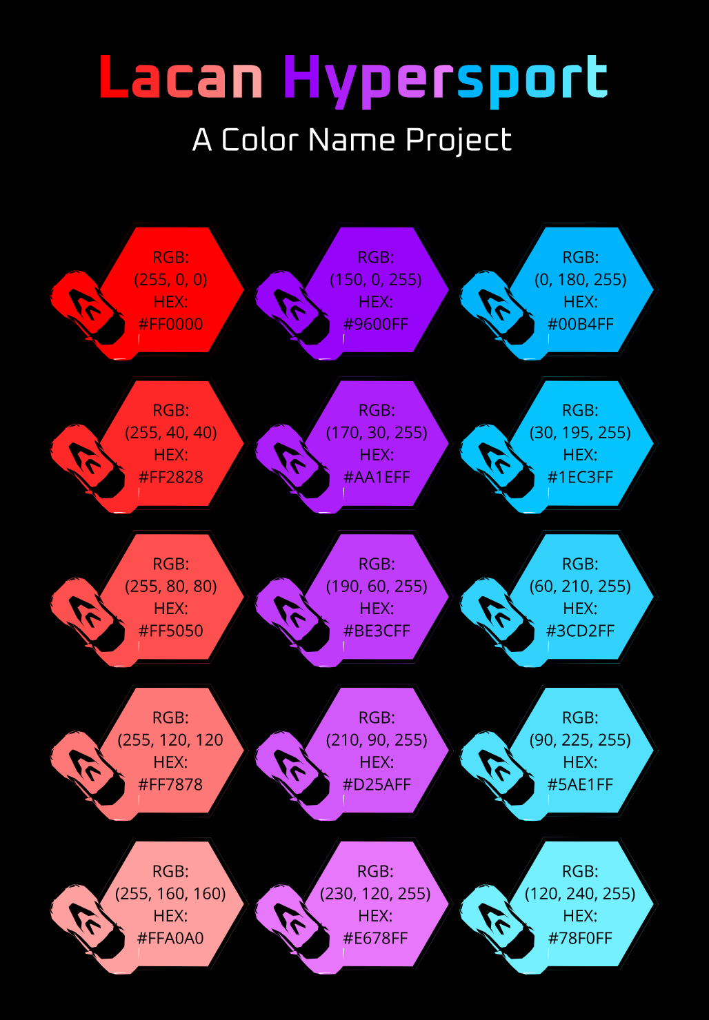 Color Schemes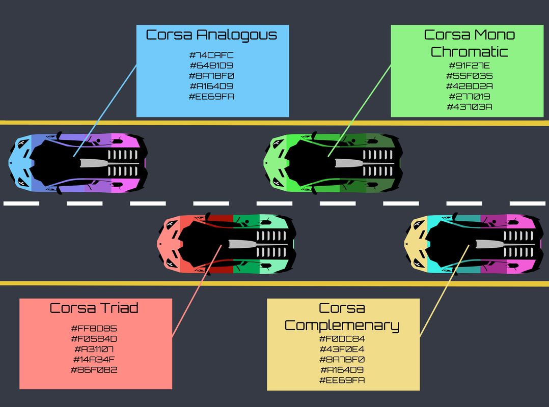 Typography is the visual component of the written word. It is important because it involves having the right font, color, size, and location to make sure the reader understands the author's message as clearly as possible. The quote "Each font has a personality and purpose" means that every single font is unique and has its own use for delivering different types of feelings. The five different types of fonts are Serif, Sans-Serif, Monospace, Script/Handwritten, and Display. Serif fonts have "feet", are using in large blocks of text, and used in print. Sans Serif Fonts do not have "feet". They are great for headlines, titles, and smaller chunks of text and used on the web. In monospaced fonts, each letter takes up the same amount of space. They do not work well for large blocks of text, but are most often used in coding. Script/Handwritten fonts are cursive, calligraphic, or handwritten. They are sometimes difficult to read, but are good for logos, large headlines, and details. Display. fonts are good attention getters. They are used sparingly, and their popularity comes and. goes. Typeface Comparison In the typeface comparison assignment, I aligned an example of each one of the five different fonts. 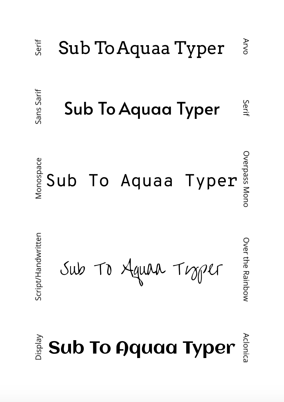 Word Portraits In the typeface comparison assignment, I made an example of a bad way to use a certain font and a good way. I did this for 10 different fonts in three different columns. 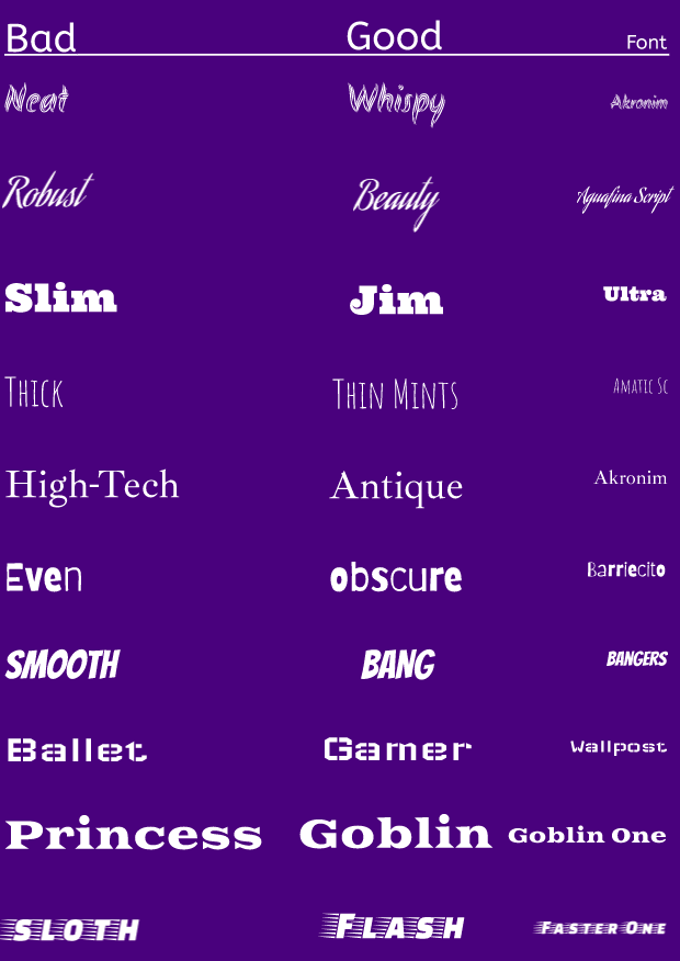 In the three pen tool exercises, I traced superhero symbols, a penny, and my own image using the pen tool on Gravit Designer. In the superhero exercises, I traced superhero symbols along the guides and applied what I learned to tracing one without any guides. It made several mistakes, but at least the overall shape was correct. In the penny exercise, the second one, I cut out Abraham Lincoln from a penny using what I learned from the superhero exercises. Lastly, I created my own composite image. I cut out something from an image with the pen tool and added that to a background image. In the beginning of learning the pen tool, it was a little difficult to trace my own pictures, but after several exercises, I could begin to easily trace any image. My final image is cupcakes flying toward a lion's mouth, and a different version with Trump and Biden. The only challenge I had was cutting out Biden's head or the lion's head because it had lots of thing strands of hair that stuck out, which I simply decided to cut through. Image Links: Meteor Background Biden Face Trump Face Cupcake Lion
  For the shapes scene summative project, I had to make an illustration of something that is meaningful to me, and I chose to make a picture of my home in America. I have lived in the house since I was four, which is almost the only place I remember living in. I loved living in this house so much I never got bored of it. While creating it, I did not run into any difficulties, and everything went quite smoothly except when my mom was yelling at me to hurry up. =P 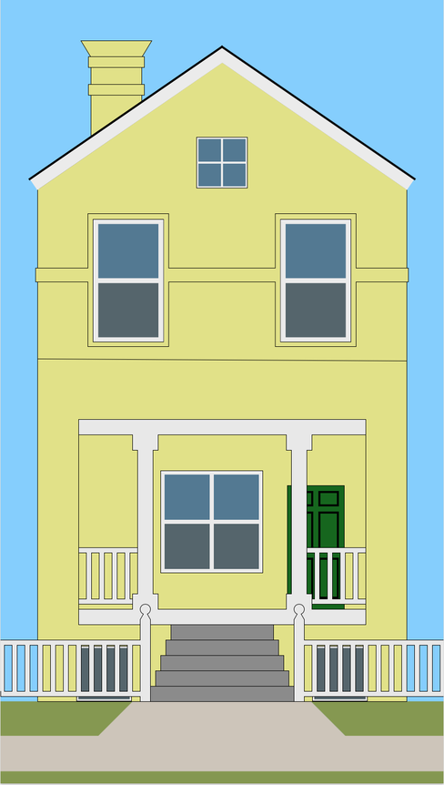 I learned how to modify shapes in many different ways and use union, subtract, intersect, and difference. Here is my work: 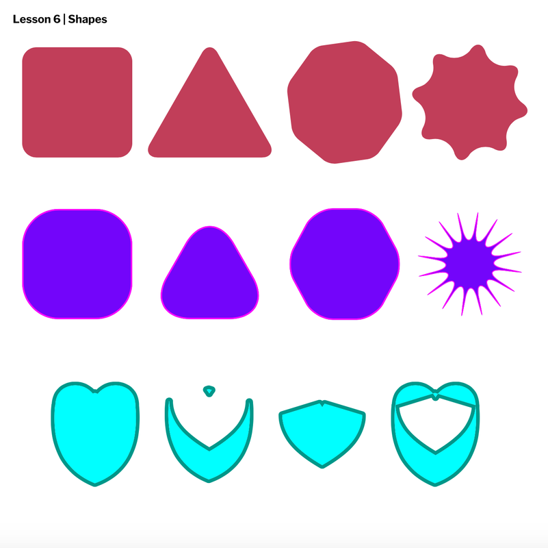 From this assignment, I learned how to group and align items and also organize them by layering them. Here is my work <3: 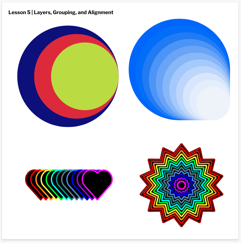 I learned how to change borders in many different ways from this task. Here is my work: 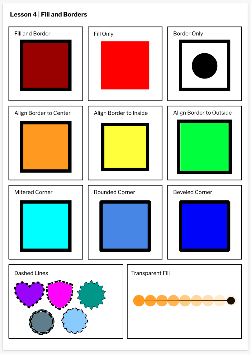 From this assignment, I learned how to make and change several different shapes. I learned to construct shapes, change. the shape of the shape, change the color, and change the location of the shapes. Here is a screenshot of my work: 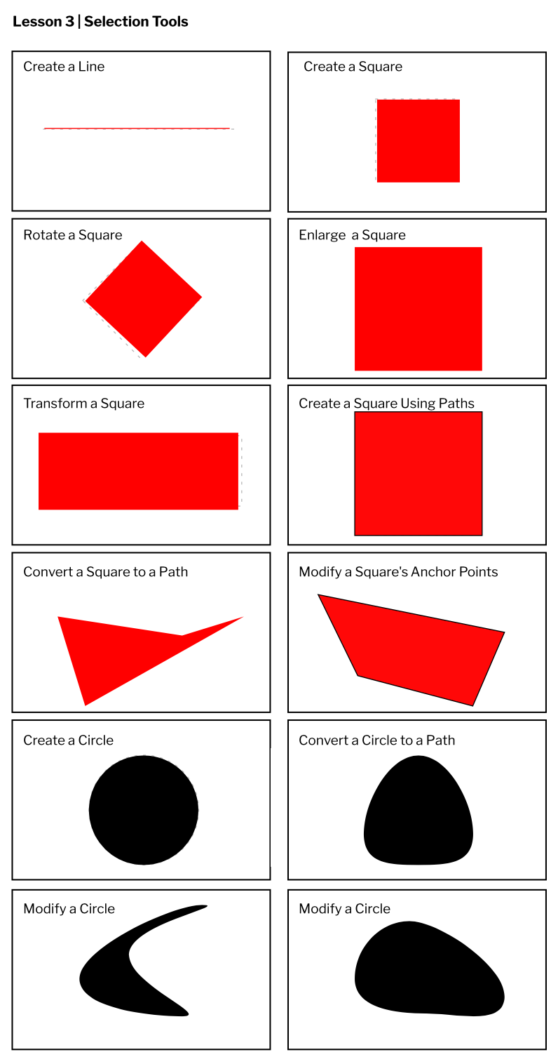 From this Gravit assignment, I learned that I will have to use Safari for Gravit. I learned how to save the Gravit document, create documents of various sizes, change the orientation and units of a page, create multiple pages on a single document, show multiple pages at once, change the color of a page, and use the Type and Alignment tools on Gravit Designer. Here is the screenshot of my Gravit pages: 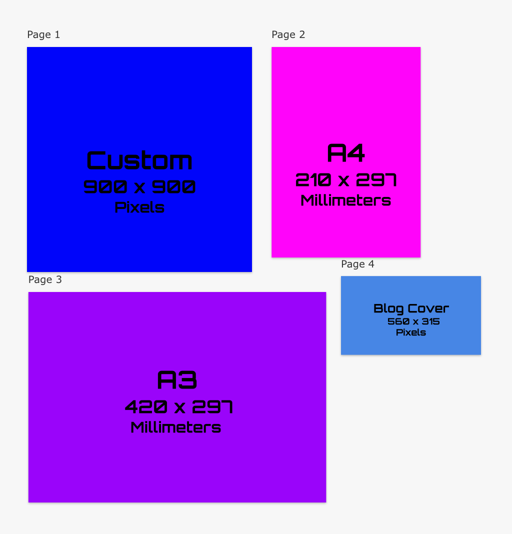 |
AuthorHey =P ArchivesCategories
All
 This work is licensed under a Creative Commons Attribution-NonCommercial-NoDerivatives 4.0 International License. |
 RSS Feed
