|
For this assignment, I was asked to create an original logo for an imaginary company. The tools that I used the most were the pen tool and the "D" tool. I drew my logo by pencil first, which I would then trace on Gravit Designer with the pen tool and adjust with the "D" tool. The most challenging part about the process was coming up with a logo design to start with. I overcame my challenge by sketching out all the different logo styles for my brand and then chose my favorite one. Here are the three different versions of my logo: 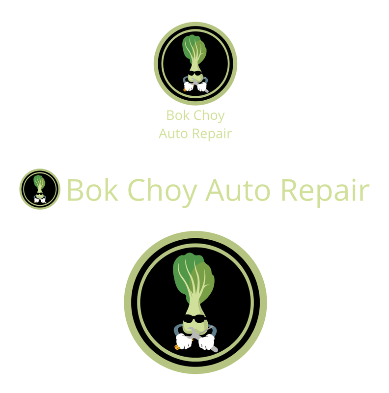 My company name is Bok Choy Auto Repair. Bok Choy was what my friends called me last year, and I am into cars, so that is how I created the brand name. I decided to create a logo like this for myself because I often see logos with a character inside a circular pattern. I also thought that it would be the best logo design. The logo is a picture of one sprout of bok choy with arms holding repair tools. This logo is my favorite because it has both thr logo and the words. It is also in my favorite format, with the text under the logo. 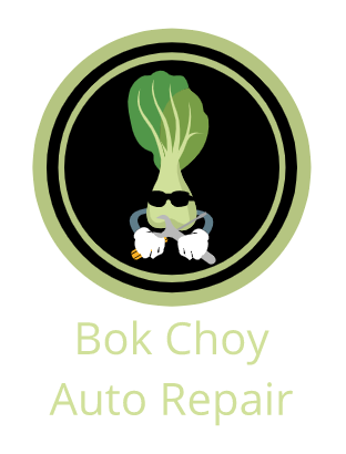
0 Comments
Leave a Reply. |
AuthorHey =P ArchivesCategories
All
 This work is licensed under a Creative Commons Attribution-NonCommercial-NoDerivatives 4.0 International License. |
 RSS Feed
